Sectioned Density Plots compare distributions across groups. These innovative graphs enlist natural, existing perceptual processes in the interpetation of the graphic. Different groups are arrayed along one axis, and the second axis presents values of the target variable.
In a sectioned density plot, the third axis is implied by the intensity of the image, and this third axis represents the relative frequency or density of the target variable. The brightest sections represent the greatest densities. Research consistently finds that the human eye (and corresponding brain parts) naturally infer a light source, and interpret more intensity as being nearer the source of light. In this case, this process makes the brightest segments seem nearer or "jutting out" at the viewer.
A sectioned density plot is carved into a specified number of sections, each section of which represents a particulary density.
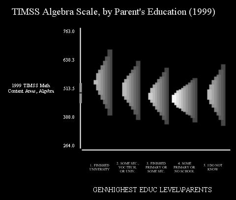
A sample plot appears below:
The sectioned density plot takes a distribution and sections it at fixed density intervals. Each section is shifted slightly to the left of, and is a bit brighter than, the section below it. By offsetting and increasing the intensity of each successive section, the plot provides the eye natural cues of height. These two features provide enough cues for the visual system to successfully interpret the brighter sections as higher.
By default, the plot appears on a black background. The dark background aids the eye in interpreting lighter colors as higher values. The overall effect is as if one is looking at a 3-dimensional distribution from above and too the right. This enables readers to perceive the shape of the distribution without much training.
The particular calculations involved in creating a sectioned density plot depend on the type of data being displayed. In general, the density is calculated at fixed intervals, just as bar heights are calculated for a histogram.
- For continuous variables, the range of the data is divided into equal intervals, and observations are categorized into a single intervals.
- For tests represented by plausible values the range of the data is categorized into equal intervals, and each observation is assigned to one category per plausible value, with the sample weight equally split among plausible values.
- For tests and substests represented by individual test items (along with the IRT parameters that link them to the underlying scale), MML estimates of the distributions are estimated first (using MML Means--separate variances for single subtests and MML Composite Means--separate variances for composite tests. Next the posterior distribution for each item is calculated. At each interval (remember the range is divided into equal size intervals), the densities of the posterior distributions are summed. After normalizing these sums, they represent estimates of the relative frequency at each interval, and they are graphed.
The graph uses an even gradient to select intensities for each successive bar, making a sequence of equal increases in intensity for each section.
The continuous axis on the graph (by default, the vertical axis) presents a partial box plot of the aggregate data. A line marks the median of the data aggregated across groups, and a wide area around the median mark indicates the interquartile range (the range between the 25th and 75th quartile.
Cohen, D. & Cohen, J. (2003) Visually comparing proficiency distributions across groups: The Sectioned Density Plot. (manuscript) Washington DC: American Institutes for Research.
Input for the sectioned density plot can be understood to have two different parts:
- The input needed to estimate the model; and,
- The input needed to adjust how the graphic looks
For the input needed to estimate the model depends on the model that needs to be estimated. Please select the appropriate link below, depending on the type of data you are plotting:
We can again divide the input needed to adjust how the graphic looks into two categories--those that are common across graphics, which you can read about here, and those that are specific to sectioned density plots, which we cover below.
Generically, AM allows you to adjust the look of different parts of the graph using the attributes dialog. Which parts can be adjusted varies across models. Most models allow you to adjust the look of the background and axes. The Sectioned density plot also lets you adjust the color of the highest and lowest section. The plot will fill in the intervening sections with colors/intensities interpolated between these two. Please be aware that you can make the graphic very difficult to read by choosing inappropriate colors. The colors of the top bar should be the same color as the bottom bar, but of substantially greater intensity.
The Sectioned Density Plot specific options (on the "Other Model Options" page) include the following:
- Number of sections. This is the number of sections used to represent the density.
- Number of quadrature points. This is the number intervals that the dependent variable is carved into when calculating the graphic. This is exactly like the number of bins in a traditional histogram. For ordinary continuous variables and plausible values, the number that can reasonably be supported depends on the number of observations--experiment with your dataset. For plots based on MML estimates, you can use as many as needed to make the transitions smooth. Please be aware that this number is independent of the number of quadrature points used in the estimation of the model (available on the advanced dialog box for the MML procedures).
- Set continuous axis. Select "x-axis" if you want to flip the chart on its side.
- Number of ticks on continuous axis. The system will put equally-spaced, labeled tick-marks on the continuous axis. This option tells it how many.
- Specify axis minimum and maximum values, minumum value..., and maximum value... If set to "automatic" the system will set this to the minimum and maximum found in the data (or the quadrature range specified for the MML procedures). If set to manual, you must set the next two options. If the specified minimum value is greater than the minimum in the data, the system will use the minimum found in the data. If the specified maximum is less than the maximum found in the data, the system will use the maximum found in the data.
- Specify decimal precision on continuous axis Usually, AM makes good default choices about the precision with which to represent axis labels. To use the default values, set this at "automatic," and the number under Decimal precision on continuous axis will be ignored. Otherwise, the number will specify the number of digits to the right of the decimal point.
- Set grid lines.This places gridlines on the chart. The y-axis on a sectioned density plot includes a boxplot of the combined distribution (combined across groups, that is). The median and 25th and 75th percentiles can be represented as gridlines. Alternatively, grid lines can appear at each tick mark, or no grid lines can appear.
- Set y-axis label size. AM presents the label of the y-axis written horizontally, because we are used to reading that way. This takes some space. This option allows users to adjust the amount of space allocate to the y-axis label.